Catalogue Raisonné. Hybrid Research Kit
Search the Catalogue
Hybrid Research Kit
Catalogue No. 115
Artist's CR 110a
1965
New York
Mixed media
Edition of 2
4.3 x 10.2 x10.1 inches / 11 x 26 x26 cm , (boxed)
- Kornblee Gallery, New York, 1966
- Gerald Laing: A Retrospective 1963–1993, The Fruitmarket Gallery, Edinburgh, 1993
- Gerald Laing: From 1963 to the Present, Bourne Fine Art, Edinburgh, 2004
- Aspects of British Abstract Art (1959–1966), Musée d’Art Moderne et Contemporain, Geneva, 2005–6
- 'Market Research Art', LIFE, 20 May
- Gene R. Swenson, 'Hybrid - A Time of Life', Art and Artists, vol.1, no.2, June
- Lawrence Alloway, 'Hybrid', Arts Magazine, May
- William Peterson, 'Gerald Laing', Artspace, Winter 1976–7
- Marco Livingstone, Pop Art: A Continuing History, Thames & Hudson, London, 1990
- Gerald Laing: A Retrospective 1963–1993, exhibition catalogue, The Fruitmarket Gallery, 1993
- David Mellor, The Sixties Art Scene in London, exhibition catalogue, Barbican Art Gallery, 1993
- David Brauer, Jim Edwards, Christopher Finch, Walter Hopps, Pop Art: U.S./U.K. Connections, 1956–1966, exhibition catalogue, The Menil Collection, 2001
- Gerald Laing: Sculpture at Chisenbury Priory, exhibition catalogue, Chisenbury Priory, 2002
- Gerald Laing: From 1963 to the Present, exhibition catalogue, Bourne Fine Art, 2004
- Marco Livingstone and Walter Guadagnini, Pop Art UK: British Pop Art 1956–1972, exhibition catalogue, Galleria Civica di Modena, 2004
- Marco Livingstone, British Pop, exhibition catalogue, Museo de Bellas Artes de Bilbao, 2005–6
- Lindsey Ingram and Rupert Halliwell (eds.), Gerald Laing Prints and Multiples: A Catalogue Raisonné, Sims Reed Ltd, London, 2006
- Space, Speed, Sex: Prints and Multiples 1965–1976, exhibition catalogue, Sims Reed Gallery, 2006
- John J. Curley, 'Hybrid Sculpture of the 1960s', British Art Studies, issue 3, https://doi.org/10.17658/ issn.2058-5462/issue-03/jcurley-1960s (accessed September 2016)
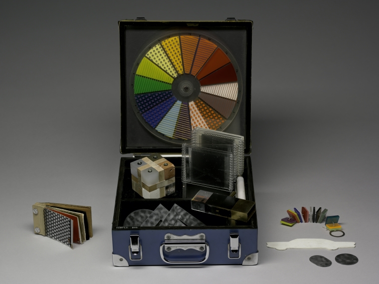
Laing and Phillips concocted a basic kit of colours, textures, sample geometrical forms, with possible configurations, as the ‘questionnaire’ - in the form of a Duchampian box. One hundred and twenty ‘art-literates’ (none of them practising artists), including the leading contemporary gallery owners in London, as well as New York critics, collectors and curators, were approached over a one-year period, from March 1965. [Lawrence] Alloway, at the Guggenheim, admired this satirical project: other leading curators - Henry Geldzhaler in particular - backed away. The computers of Bell Telephones in New Jersey handled the analysis of the responses and Laing and Phillips built an art-object from those averaged-out desires and expectations which they solicited. Laing’s dealer, Richard Feigen, ran shy of showing it, and so in April 1966 this art consumer’s Frankenstein was exhibited at Jill Komblee’s gallery on 79th Street. This collective fantasy or fiction was called Hybrid: it was, in the end, a sculpture with diagonal coloured stripes and a wavy, clear perspex top; generically it was instantly recognisable as an English ‘New Generation sculpture’.
The Sixties Art Scene in London, David Mellor, exhibition catalogue, Barbican Art Gallery, London, 1993
Laing… was approached by Phillips about collaborating. They first considered producing a painting together but decided instead to form a market research company, ‘Hybrid Enterprises’, with the aim of producing an art object determined by the demands of the informed consumer. They constructed two kits containing samples of colours, patterns, shapes and materials - from canvas, paint, wood and fabrics through to modern synthetic and industrial materials such as plastics and metals - and devised a questionnaire with which they interviewed 137 critics, collectors and arts administrators in various cities, including New York, London, Chicago and Los Angeles. The results were designed to be fed into a computer, but this proved difficult because of their inexperience in framing the questions; they also admit that the choices given were not as wide as they would have liked: for example, interviewees were offered the choice between ‘abstract’ or ‘figurative’ although there was no practical way of incorporating specific imagery. Such minor hiccoughs did not greatly concern them, since their main interest was in seeing the concept through. The resulting editioned sculpture (1966) - incorporating aluminium, plexiglass and a fluorescent tube within a wedge shape, the striped pattern at the side producing a chevron image with the aid of its reflective metal surface - was, as Laing himself later acknowledged, ‘an assemblage of trendy 60s notions’. The high sales for Hybrid (the Fogg Art Museum at Harvard University was one purchaser) neatly completed the project, but it remains an ambiguous statement about the relationship between the artist and the audience for whom the work is intended. Even Phillips and Laing fail to agree about it, Phillips seeing it as an amusing gesture about the art world but Laing going much farther in acknowledging it as a satirical attack on the manipulativeness of the art market.
Pop Art: A Continuing History, Marco Livingstone, London, 1990
In 1964 you wore a lightweight suit and it was all get-up-and-go. The artist had a role in society and he sprang up carrying his zipper bag full of slides and photos, wearing short hair and a pair of droopy sunglasses, and humming ‘He’s a rebel’. We overcame our nostalgia for the fighter can and the Morgan 3-wheeler, and wholeheartedly and unashamedly embraced the convoluted and highly chromed exhaust pipes of the extravagant hotrod, with all of its implications. If there was a problem, then technology and money could solve it. Sure, after all, we’d just started to conquer Outer Space… Hybrid was a pure expression of that time.
The late Gene Swenson, the conscience of the sixties, reviewed it when it was exhibited at the end of the research process. My nose was so firmly applied to the grindstone that at the time I could not see what it was that he was saying; but I re-read the article recently, and it describes the implications of it all perfectly, and the growing sickness of the art scene.
Swenson does not attack Peter [Phillips] and myself in the article; he credits us with reacting as artists to a given situation. Though Hybrid was a precursor of much activity in the area of conceptual and process art which followed, it was indeed intended as a satirical attack on business methods, market research, and hard sell. The gesture, the fact of doing it, was to us the important part. At first we did not even intend to make an end product at all. The manufacture of the Hybrid art object was simply a final flourish, almost an afterthought. The manner of operation, however, was carefully presented. We assessed two immaculate boxes containing samples of material, colour, shape, texture, pattern, and fluorescent
light, had answer forms printed and, snappily dressed and wearing blue and white Hybrid buttons, went around asking people to describe the components of dimensions of their ideal art object. We quickly found that it was no use asking other artists to participate, because they could simply bend the contents of the box to make whatever it was that they were making themselves at the time. Anyway the point was to describe the components, not a finished item. Dealers considered the whole thing a threat to their existence and ran when they saw us. Critics, notably Henry Geldzahler, some of whom had enthused when the idea was first suggested, vanished as we approached. The only willing participants – and probably the best from our point of view – were Funloving Art consumers. We interviewed about 140, mostly in New York, some in London. And almost in spite of us a sort of pattern began to emerge, and we started to consider the possibility of completing the process and making the ‘Hybrid’.
At the end of our research period we had the following information: 1. Choice of 2 or 3 dimensions; 2. Average dimensions; 3. Number and choice of materials; 4. Number and choice of colours; 5. Number and choice of textures; 6. Amount and type of pattern; 7. About 140 drawings.
Though numbers 1–6 were easily analysed, number 7, which was composed of shapes chosen from those in the boxes or by freehand drawing, presented problems, largely because number 1 called for a three dimensional object and the drawings were two dimensional with no stated convention for volume. We went to the Bell Telephone Company’s computers in New Jersey and averaged the forms as best we could; but in the end their selection was rather arbitrary, as was the actual disposition of numbers 2–7. All the results of the survey together with plans for the finished Hybrid were assembled on a blueprint by Terry Stewart [a British architect and friend of Laing who was also living in New York at the time], and it is fascinating to study because it is, at the very least, a description of taste and aspiration in New York in the mid sixties. For instance, the choice was overwhelmingly in favour of a three dimensional object; and yet the survey was conducted well before the Jewish Museum Minimal Art exhibition of 1966, which was the first major sculpture show of the period. Similarly, the choice of materials was fairly exotic, and yet most galleries at that time were showing oil paintings on canvas. The items used in the process, together with two full-steel Hybrids and 25 desk models (conversation pieces) were shown at the Kornblee Gallery in 1966. The art establishment was deeply offended and chose to ignore the event. But the media had a ball.
'Hybrid', Gerald Laing, unpublished manuscript, date unknown
-
 Hybrid Blueprint
 -
 Hybrid Research Kit
- Hybrid Maquette (with Peter Phillips)

